Most modern documents have at least one embedded image. From Keynote and Powerpoint documents to websites and instruction manuals - they all have an image somewhere, even if it's just a logo. But as familiar as we all are to this "Ooh, look a picture" phenomenon, so many of us simply do not know anything about raster vs. vector image files or how to deal with them.
Diving Right In » Raster vs. Vector
All image files fit into one of two categories: Raster or Vector.
 A raster image is the type of image that most people are most familiar with. It's made up of millions of coloured dots that, if dense enough, form an image. It is easiest to see the 'dots' concept in old newspaper images, but all photographs are raster images whether analogue or digital, modern or vintage.
The density of these dots is known as DPI or dots-per-inch, which works in the same way that your HDTV or computer monitor resolution works. The higher the number (i.e.: the denser the dots,) the higher the resolution of the image and the sharper and closer the image is to the true analogue: reality.
 A vector image is a completely different concept. They are made up of strokes (lines,) fills, distances, and directions (hence, vectors,) rather than pixels or dots. Vector images don't have a DPI quotient as they have no dots. Rather, they have sets of coordinates with distances and colour data embedded that make shapes. These shapes, when combined, form an image.
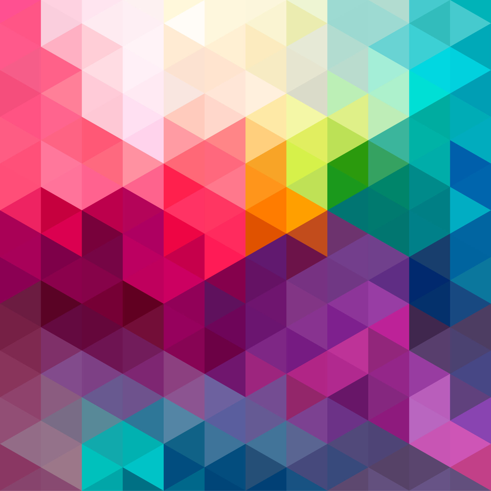
Don't get the impression that all vector images look like the one above - far from it. Some of them are very detailed and can look fairly realistic, but the example above, I feel, best illustrates the shapes that make the image.
Ok, so now that we know what they are, let's discuss a few of the specifics, pros, and cons of each image category and the files they inhabit.
Head to Head » Raster Vs. Vector
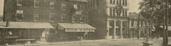
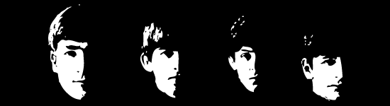
Both raster and vector images use the same technique in achieving their goals. They are both attempting to fool the eye into seeing what it is not. In the case of a raster, you are looking at coloured dots, not an apartment building. In the case of the vector, you are looking at a 550px by 150px block of black fill with some white areas removed rather than the 4 Beatles. Both image types are impressionists and the higher the detail they deliver (DPI or vector detail) the more they "impress" the intended image upon your brain.
 Raster images are generally a bit better at realism than vectors are. They deliver a more dense, colour rich environment for you to get your realistic impression. But they do this at a cost, a few in fact: take a look at the image to the left and imagine if this were a photograph. What would our raster image (photograph) have to "record" in order to achieve this image?
Well, it would have to record one pixel for each dot making the image and assign a colour to that dot, in this case, either gray or white. No matter how detailed the image is, it HAS to record each and every dot in the image. In this case, that seems to be a huge waste of data doesn't it? I mean, all we have is a bunch of gray with a single white point, yet we have thousands and thousands of dots being recorded.
The vector image, on the other hand, records this as a 50px square box, filled with gray at coordinates (0,0) and one, 1px point filled with white at coordinates (30,30). That's a huge difference in data! How much? Well, a full quality version of the raster image would be about approximately 3700 bytes whereas the vector would be around 600 bytes.
Here's another difference between the two: Zoom. Let's try to zoom into our vintage shop in the top image. Specifically, let's zoom right into the 'D' in 'SODA WATER' and see what happens.
 Ouch! Our pointillism image has suddenly become a cubist's dream. Why have we lost clarity like this? Let's round the numbers off to make it simple. Let's say that our original photo was made up of 100 pixels per inch and we zoomed in 400%. Well, we didn't gain pixels in doing that. All we did was spread the existing pixels apart and "guess" (or extrapolate) at what might be in between. But guessing is not reality. It's distortion! You can see what we ended up with: that's kind of a 'D', I think ...Isn't it?
 Vector images, because they are lines, points, fills, and coordinates don't have this scaling problem. Our 50px gray box simply becomes a 200px box and our 1px point at (30,30) simply becomes a 4px point at (120,120). The quality is exactly the same even if you zoom in by 1 million.
Everyday Use » The Rasters and Vectors Among Us
Does this make vectors more important or better than rasters? Not At All! They have a completely different role in the image world than rasters do. You'll never get the clarity of a high-density raster from a vector, not even close. And you'll never get the scalability of a vector with a raster. But interestingly, most people have simply never even heard of vector graphics yet they see and use them every day.
Where? FONTS! Fonts are vector images. Each character in a font series is a set of vector coordinates that allows you to scale them according to what you need on the page without losing quality. In fact, the larger the font, generally the better it looks on a computer monitor. Here's something else... where do you see rasters and vectors together most often? You probably use this type of file every day and never knew what you were seeing: PDFs.
Most PDF files are pure vector files, hence why you can zoom way in and it looks just as good. PDFs, though can also be raster files in a vector framework. Scanned documents that are saved as a PDF are still raster files, zoom in on them and they will lose quality as we saw before. PDFs with, say, screen-shots embedded in them (like a printer manual,) when zoomed, will maintain clarity with the fonts and shapes, but the images won't look so hot.
Ok, so there is the raster vs. vector run-down. We'll continue on to file types, colours and alpha transparencies, zoom vs. crop, and aspect ratios in the next article.
*1 - There is also a modern art style that mimics this 'dots' concept called pointillism, painted or drawn images that comprise points of colour or ink rather than strokes. *2 - Vector images can be likened to a number of modern art styles, Cubism probably being the easiest to equate. *3 - Okay, I know that image compression can group like pixels and thus save on recorded data and file size but that's another topic and, pointing it out would simply muddy the waters. *4 - Please don't bombard me with emails about the fact that one, these vector images are rasters of vectors or that, two, image compression tends to narrow the file size field. I know that, but it confuses the point I am trying to get across. If you are savvy enough to point that out, this article is probably not for you!